How to style Pantone colours of the year while interior designing
2020 has undoubtedly been a year out of the blue! Each year, the color company Pantone, originally being the provider of professional color language standards, and X-Rite Incorporated, selects a Color of the Year inspired by trends in culture, travel, and society and more. In fact, Pantone’s colour choice of the year sets the indefinite return to traditional styles of decorating home and offices and paves way for new inspiration. Pantone’s color choices are the forecast authority nearly every industry follows including interior design firms, fashion design companies and more.
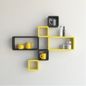
To bring the ball down on yet another decade, it was recently announced that the Pantone Colors of the Year 2021 are Ultimate Grey (PANTONE 17-5104) and Illuminating Yellow (PANTONE 13-0647). For the first time in 22 years, two shades have been chosen, the former representing firm and dependable, the marriage of which represents strength, optimism, and fortitude following a markedly challenging year and the latter a bright and vivacious tone welcoming the new year.
Pantone’s data is nearly perfectly parallel with trends or is rather the trendsetter itself. So if you’re wondering how you could incorporate the color of the year into your home or work spaces, here are a few suggestions from the experts of J.J. Poonawala.
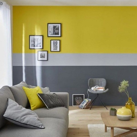
Paint the wall and the new year brighter
Turns out, the simple blend of colors is a favorite of many interior designers given its versatility and has infact been a huge trend in various parts of the world across the map including the real estate market over the past few years that has led buyers to be influenced by colors. Bold and bright colors that would once have been a deal-breaker to potential buyers are inturn selling houses now because of It’s versatility and luxury and calmness. So go ahead and paint that wall yellow or grey or even both!
Furniture that speaks to you
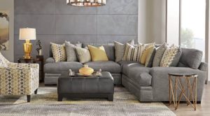
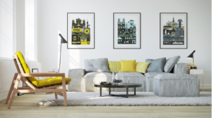
The colour of the year in 2020 was Classic Blue, which in contrast was accompanied greatest as a splash of colour on a wall or in a room while this year’s Yellow and Grey are both timeless colors. They work well together or singularly in every single room of a home—be it the bedroom, the rest room, the study, the office or even the kitchen. This versatile hues can be used to add a touch of sophistication by adding stools of the colour to the kitchen or adding a sense of calmness through yellow chairs and grey desks at the WFM office. The classic colors pair extremely well and can stand out. So lift up the spirit of a room with the classic and edgy hues of furniture.
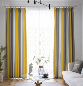
Colour the space With Drapes And Sheers
It was once said that “A house that is designed with a vibrant and classical color scheme often leaves a more positive impression than a space that was designed to be neutral: good colors, good impression; neutral colors, neutral impression.” with Grey and Yellow being the colors of the year, incorporating them through sheers would subtly elevate a room. Drapes also work best for home offices or studies are a great place to consider for a Classic hue transformation.
Luxe It Up the light way
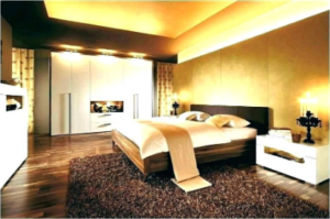
Paying ode to the richness and royalty of the color of the year, adding classic bedroom accessories such as shadow lights or lamp stands could add the perfect touch of luxe whilst keeping in mind its uniqueness and value.
Mix it up
If too much of contrasting hue is not for you then mix it up with accessories and accents of all sorts that will spruce up a place in a gist. From bed spreads to walls with designs to murals, let the subtle color of the wall along the touch of yellow and grey elements lighten up the room in different ways, shapes and sizes.
The Pantone colors of the year are a versatile pair and can go hand in hand while furbishing any space, so design away and welcome the new year the right way!


