Combining Colours To Create A Vivid Interior Look
The days of shying away from vibrant hues are long gone. It’s the age of exploring, experimenting, and making all your eccentric wishes come true. So pick up the palette, put a finger on your favourite shades, and let’s turn your imagination into reality. Here’s your guide to blending colours to create a wishful radiant interior look!
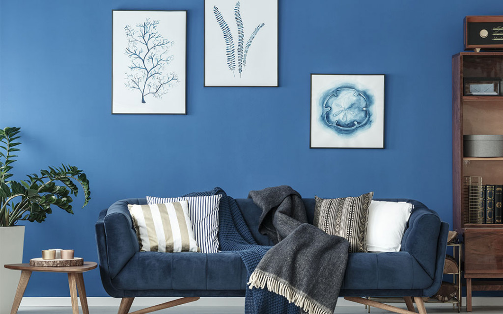
Demarcate By Descent
We’ve all at some point been to a space that felt cluttered and claustrophobic, and that’s the last kind of energy we want in our own space. So pick your most-loved tones, but try not to exceed choosing 3 distinctive colours. Once you pick a bunch of basic colours, it’s easier to work within the shades of those unique tones as opposed to having numerous basic colours. Shading a space with different variants of the same colour gives it a definitive character, making it meaningful as well as vibrant.
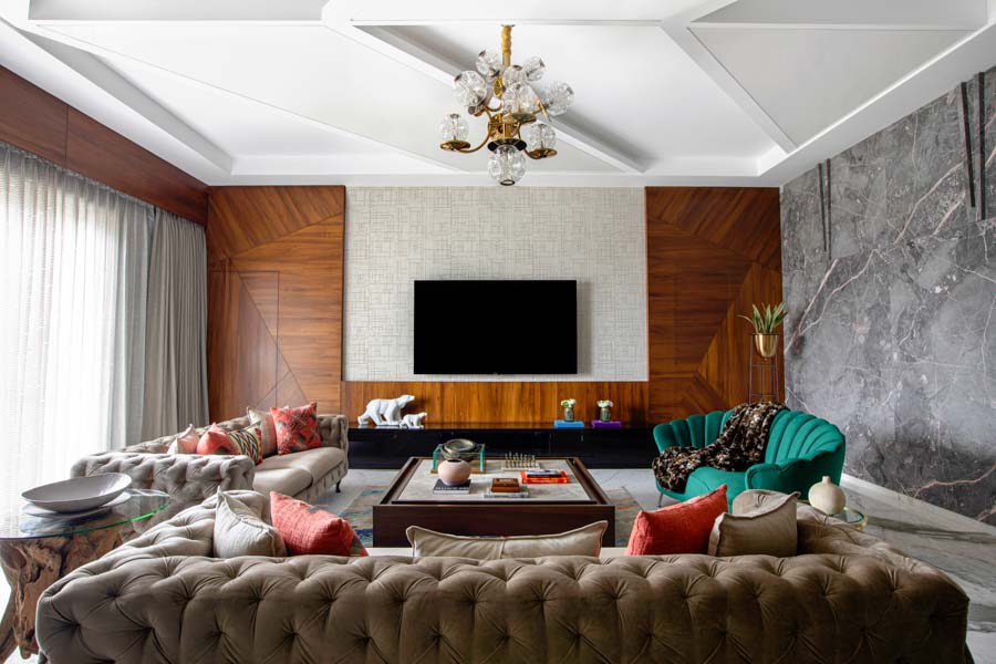
Confident Combinations
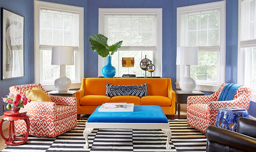
Not sure if your choices will merge well with each other? A few colours were simply matched in heaven. We love a white and blue Mediterranean mix, a green and yellow outdoorsy blend or even an orange and purple union. Make the most of these tried and tested favourites, as they tend to be familiar to the eye which makes people comfortable instantly. Adapting classic combinations to furnish your room isn’t old-fashioned, it just reduces the risk of a mishap and boosts the chances of you loving the outcome!
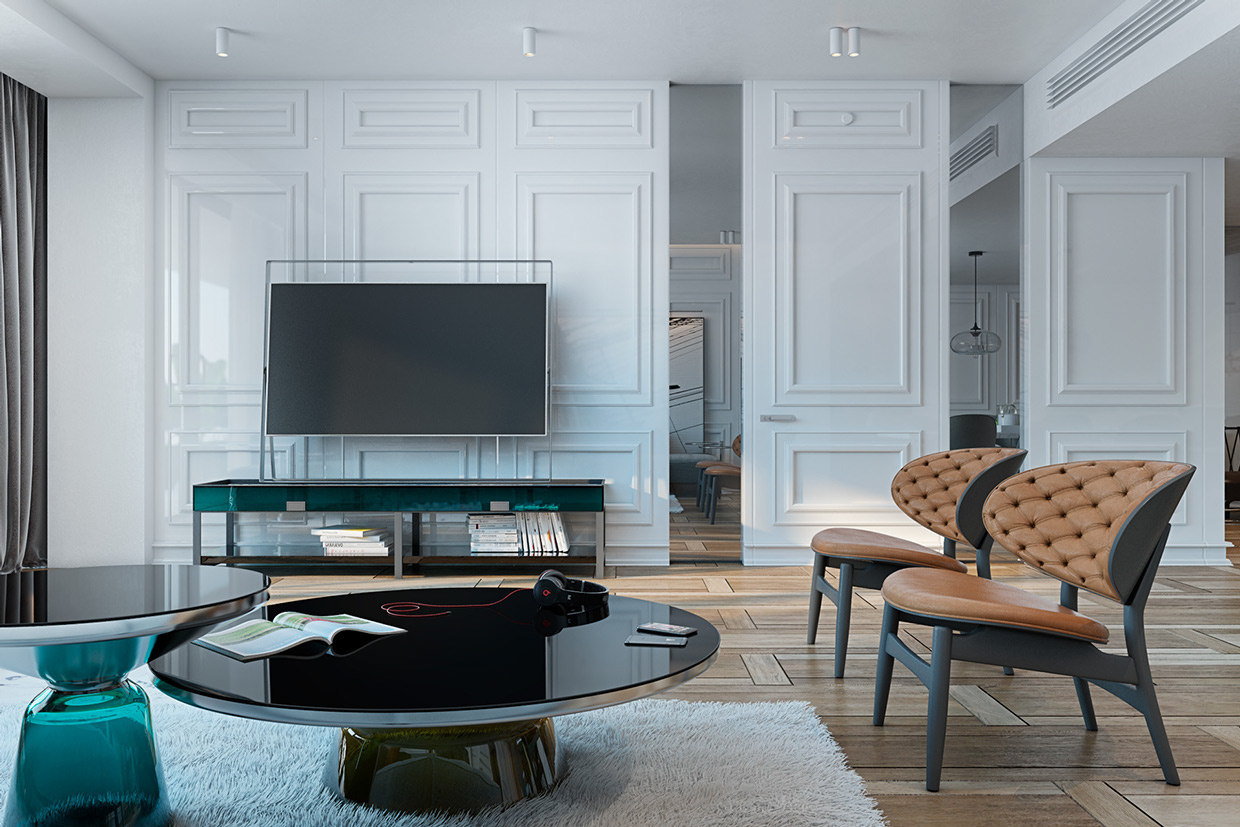
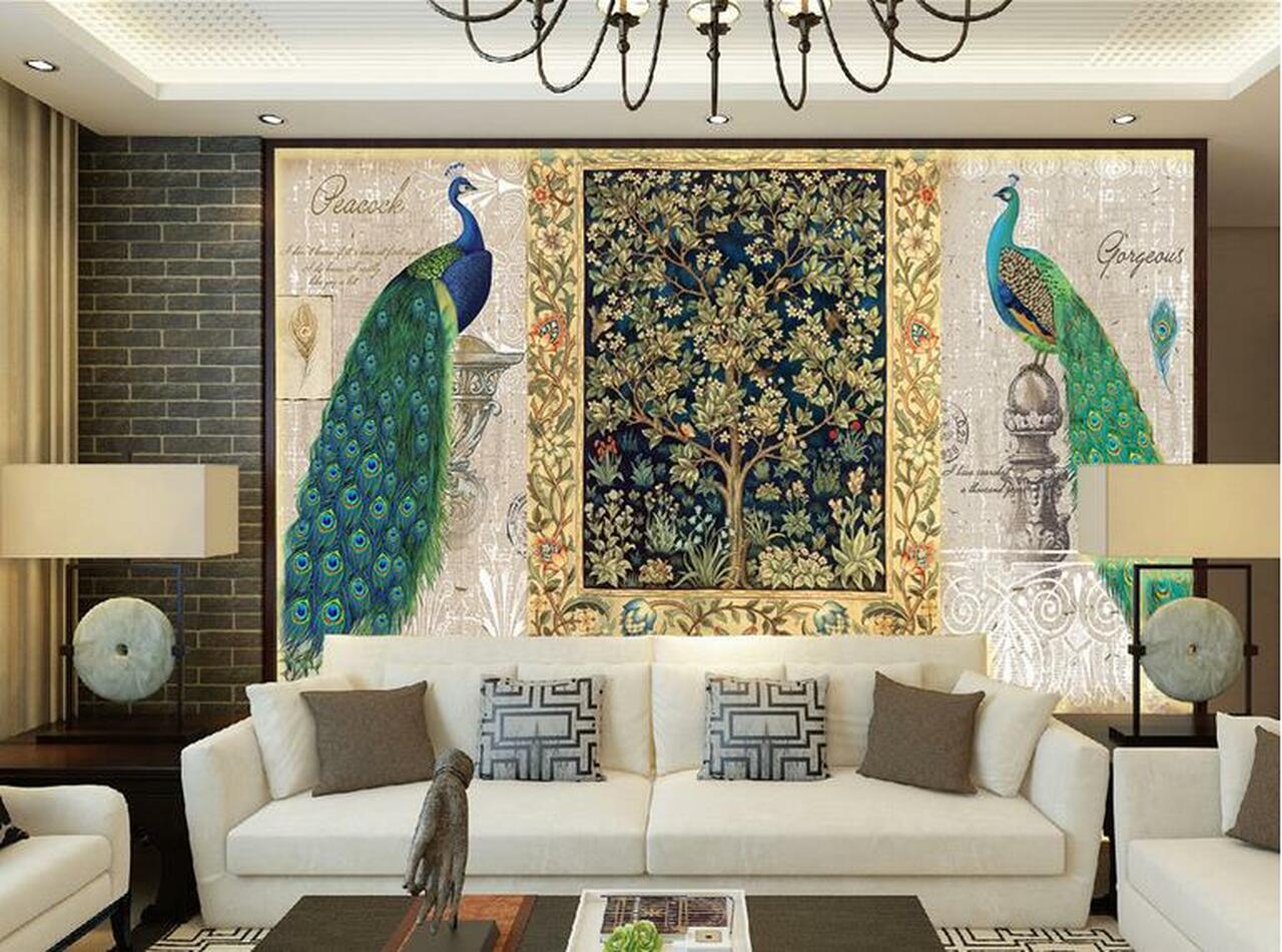
White Wonder
The colour white brings with it a package of elegance, freshness and simplicity. The most versatile of them all, this colour can be paired well with any shade from the palate. Adding accessories or even a statement piece of furniture laden in white can uplift your space to a great extent. Whether you choose to go with pastel shades or a quirky combination such as purple and gunmetal grey, a little white balances it out and brings a little sanity within the splashes of colour.
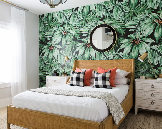
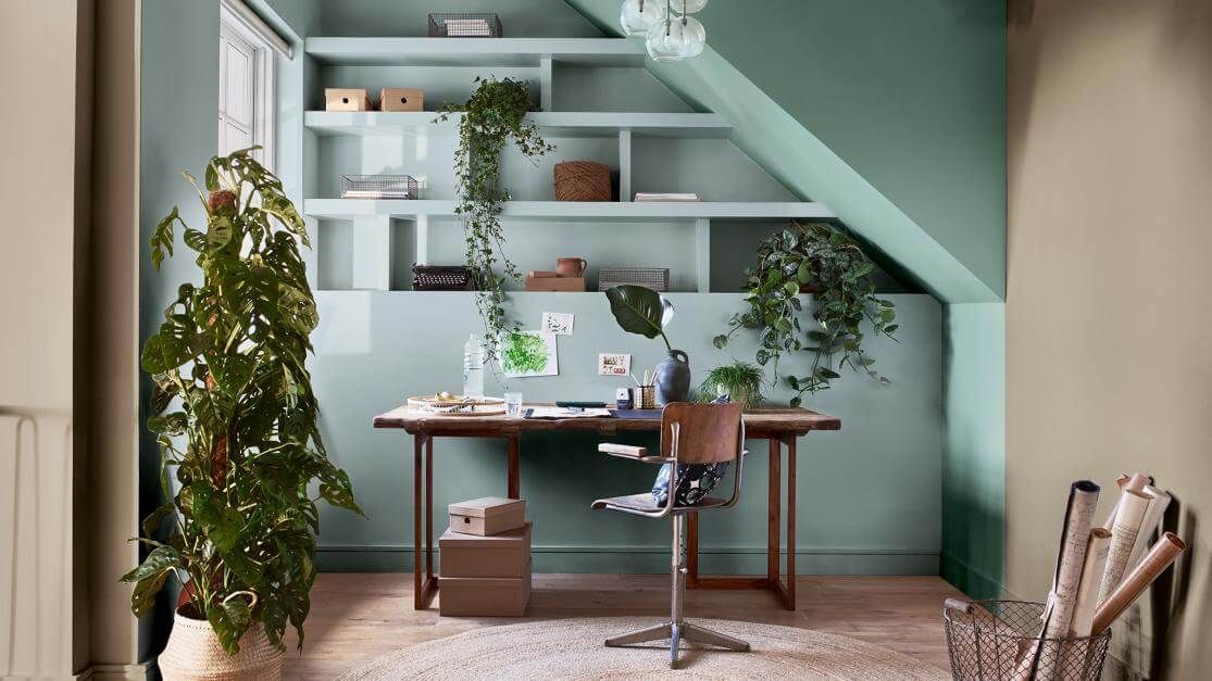
Binge In Balance
A little mix of textures never hurt nobody, but beware. To maintain a balance of spreading colour with materials of different finishes, keep in mind the proportion of patterns to colour blocks. Patterns add to the design element of the expanse, whereas colour blocks add the vibrancy and set the mood of it. A simple way to manage the two is to work in percentages, for it aids you get a better understanding of how much of a certain element you’d want to comprise your space.
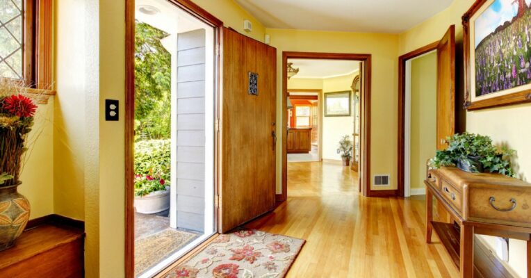
Keep It Connected
Blending hues sounds wonderful, and an aspect that frequently gets missed out is drawing connection between the entirety of the place you’re designing for. While having distinct rooms giving off individualistic vibes is wonderful, there has to be a sense of continuity. Standing in the hallway or at a point at the address that enables you to see multiple angles of it will bring perspective of this, stressing on how there should be at least one facet that is common to the entire place.
Space Separators
It’s truly a luxury to have a large area to work in, and we must make full use of it. While playing with the colour palette, maximise the utility of the space by creating corners with colour. Each shade can be representative of a different activity or mood, yielding the most out of the available extent.
So grab your palette, assert your colours of choice, and get playing with the plethora of shades available! Refurbishings have never looked more exciting, and we can’t wait to see your complete canvases, full of life and colour. Lastly, keep in mind – if there isn’t a shade for you, feel free to make one!